The challenge
What.the.disk is a personal UI exploration that investigates a simple question: what would an app look like if it were designed around a single purpose? The concept focuses on helping users quickly find artists and albums—whether they're trying to remember the name of a record or discover something new without navigating a complex music app. By stripping the experience down to one core task, the project explores clarity, speed, and visual simplicity.
The solution
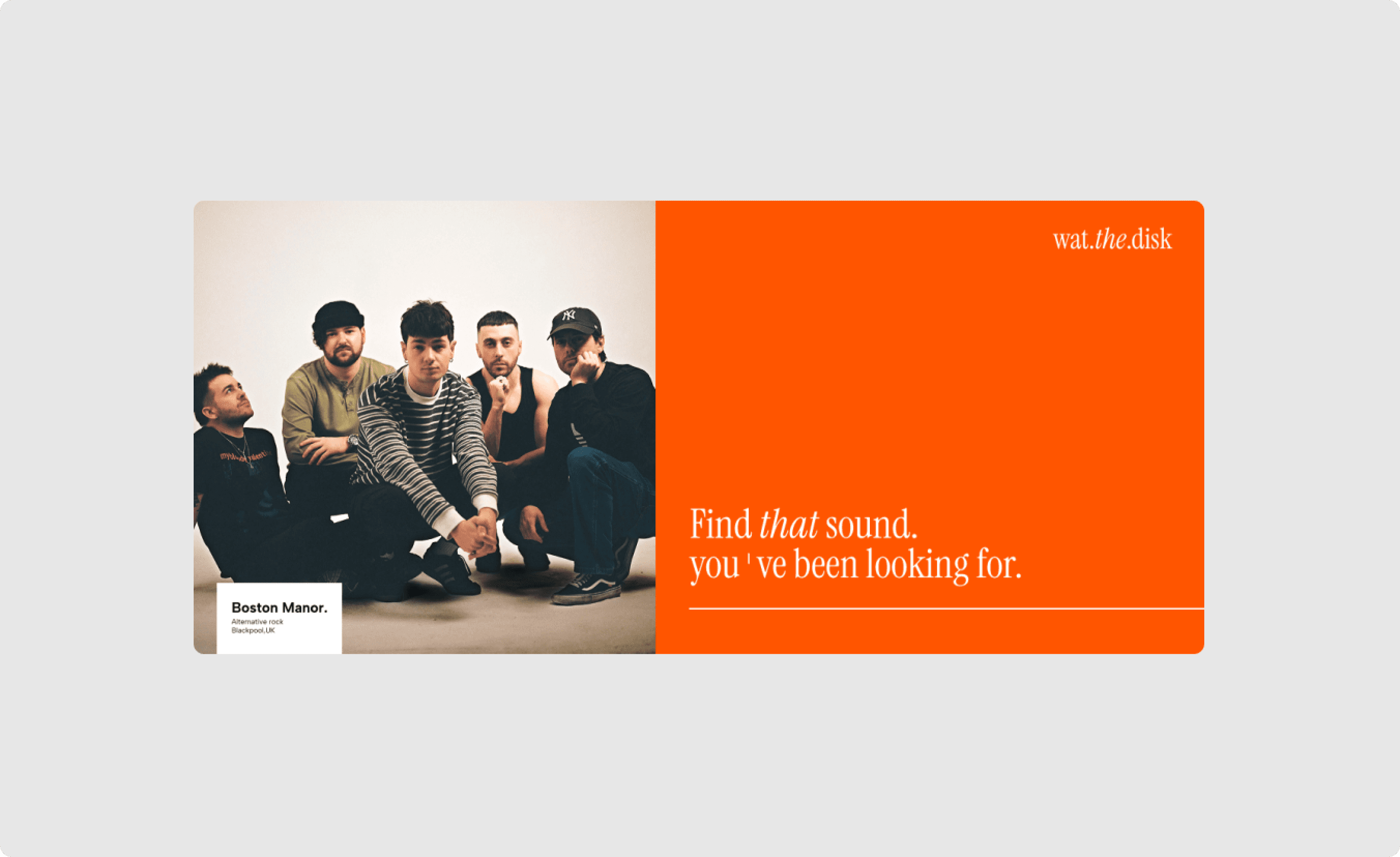
The interface was designed around a minimal set of components, prioritizing search and filtering as the primary interaction. A clean visual hierarchy, generous whitespace, and a restrained UI reduce cognitive load, allowing users to find artists and albums with as little friction as possible. White serves as the dominant canvas, while a vibrant orange is used selectively to highlight actions and guide attention toward key information. Beyond the product interface, I explored the visual identity through branding concepts, promotional posters, and advertising assets to create a cohesive design language across both the product and its marketing touchpoints.
The challenge
What.the.disk is a personal UI exploration that investigates a simple question: what would an app look like if it were designed around a single purpose? The concept focuses on helping users quickly find artists and albums—whether they're trying to remember the name of a record or discover something new without navigating a complex music app. By stripping the experience down to one core task, the project explores clarity, speed, and visual simplicity.
The solution
The interface was designed around a minimal set of components, prioritizing search and filtering as the primary interaction. A clean visual hierarchy, generous whitespace, and a restrained UI reduce cognitive load, allowing users to find artists and albums with as little friction as possible. White serves as the dominant canvas, while a vibrant orange is used selectively to highlight actions and guide attention toward key information. Beyond the product interface, I explored the visual identity through branding concepts, promotional posters, and advertising assets to create a cohesive design language across both the product and its marketing touchpoints.
The challenge
What.the.disk is a personal UI exploration that investigates a simple question: what would an app look like if it were designed around a single purpose? The concept focuses on helping users quickly find artists and albums—whether they're trying to remember the name of a record or discover something new without navigating a complex music app. By stripping the experience down to one core task, the project explores clarity, speed, and visual simplicity.
The solution
The interface was designed around a minimal set of components, prioritizing search and filtering as the primary interaction. A clean visual hierarchy, generous whitespace, and a restrained UI reduce cognitive load, allowing users to find artists and albums with as little friction as possible. White serves as the dominant canvas, while a vibrant orange is used selectively to highlight actions and guide attention toward key information. Beyond the product interface, I explored the visual identity through branding concepts, promotional posters, and advertising assets to create a cohesive design language across both the product and its marketing touchpoints.




02:10:21